I recently wrote about contemporary office furnishings and mentioned how many people believe that contemporary decorating means using only the color white. However, it’s not only modern styles that overlook color. Those with traditional decor also often neglect using color. So why is everyone so hesitant to incorporate color into the workspace?
 People are afraid of making a mistake. They don’t want their choices to clash or to be too bold and they want to make the best impression, while still enjoying the space they must work in each day. Another reason people avoid color is because those around them avoid it too. They have seen others fail at the attempt and don’t want to make the same errors. In order to avoid such issues, we need to see what those who use color the most already understand.
Designers and artists have used color to stir emotions for years. They have studied the psychology and understand how different colors and shades affect people. For instance, purples, blues and greens are known to be very calming and creative colors. Oranges and yellows can stimulate people and reds make some people more aggressive or energetic. All of this is good information to have when you are considering adding color to the workspace, or even to your own personal work area.
 Adding color does not mean you have to completely change your decor. Extreme change can be fun, but is not always necessary. Think about your company’s advertising color scheme and if that might work within your business as well. Color can be added to pieces of furniture or achieved by incorporating it into the overall decor. Try adding something that is easily removed like a throw pillow when you begin. That way you can embrace a little color into your space and see if it works for you. Then change it out if it doesn’t work for you. Some people choose to hang swatches of a color they want to see if it would work for the wall or the upholstery. This gives them a chance to visualize the new look without fully committing to the change. I suggest using large swatches over small for this to get a better idea of what it might truly look like.
Minor ways to add pops of color to a room:
- Flowers or plants
- Throw pillows
- Artwork
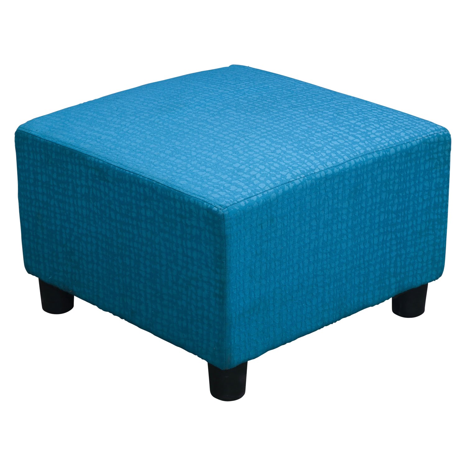
- A single furniture piece, i.e. footstool or a single chair
- Rug
- Colored office supplies strategically placed
- Personal items
- Rows of books
Major ways to add color to a room:
- Carpeting
- Furniture sets
- Paint or wallpaper
- Large pieces of art or sculpture
- Built-ins, such as reception desks
 Generally, it is best not to saturate a single area like a wall in bold solid colors, especially if they are not bright. Some colors while great in small spurts or as accents are not good to use large areas. It can create an atmosphere where it is difficult to concentrate, or can cause anxiety. The same can be said for very light sterile looking areas. One way to overcome these issues is to use shades in the same color pallet in your design. This will add some dimension to the space, as well as bringing some brightness to the area.
The key is balance, not too much of any one color within the space. People have harried lives, so they generally gravitate to warm areas where the atmosphere is calming. Creamy walls with accents of browns, greens or gold work well together. While bold colors like red will really pop within lighter decors. Remember that white is also a color. If you have a dark space, consider adding pops of white to brighten up the space. Color is personal and only you can ultimately decide what to use. What’s important is to find what works best for you and go with it.